A Self-Portrait with Quince and Finch (2012 - 2015)
For my first in depth post, I have decided to focus on my work and the processes behind it – particularly my experience of working digitally versus using traditional methods. To be clear from the outset, I would never advocate for one over the other. From my personal practice I have found advantages and disadvantages to both, and any preferences I have are purely personal, relating to the kind of work I strive to produce. However, I hope you find some of my insights of interest or use.
The illustration and comics you can find on my ‘work’ pages are predominantly produced in Photoshop, and drawn using a Wacom Cintiq. Such is the power of this combination, the line between digital and analogue becomes ever thinner. It took time to fully master, but I am now confident enough in producing digital illustration that I would confidently describe my work as ‘hand-drawn’, despite its digital inception.
For me, the key to this is treating the Cintiq/Photoshop combination as a digital light-box. To explain what I mean, I will start by briefly describe my method of producing ‘These Pretty Thieves’ – my entry to the 2014 Jonathan Cape/Observer Graphic Short Story competition. Aside from the final assembly and colouration, this work was created almost entirely on a traditional 12 field animator’s light-box.
Inspired by the engravings of Gustave Doré, I really went to town on the cross hatching and detail. It was also the project on which I challenged myself to learn to draw in perspective, and was rendered exclusively in black fine liners and brush pens. It took forever. I was holed up in my loft room, sketching blue-line images, then tracing them meticulously on my light box. I worked in layers – all of the text and scrolls were inked separately from the main images – some images where traced and then retraced from the roughs. I lost count of the times I tried a mental ‘cmd + z’ before realising a mistake was permanent. More satisfying was the mental ‘cmd + s’ – feeling satisfied with an image and knowing all I had to do to keep it safe was close the roof window and shut the door to keep the cat out.
These Pretty Thieves: Individual Hand-Drawn Panels
Toward the end of it all, it dawned on me that I had in effect been operating an analogue version of Photoshop – and as the deadline loomed, I worked out some of the final images digitally before printing and hand tracing. For all the effort, I never felt truly in control of the process. I was pressed for time, and lost clarity in the storytelling when the final entry was assembled. I did, however, learn a lot.
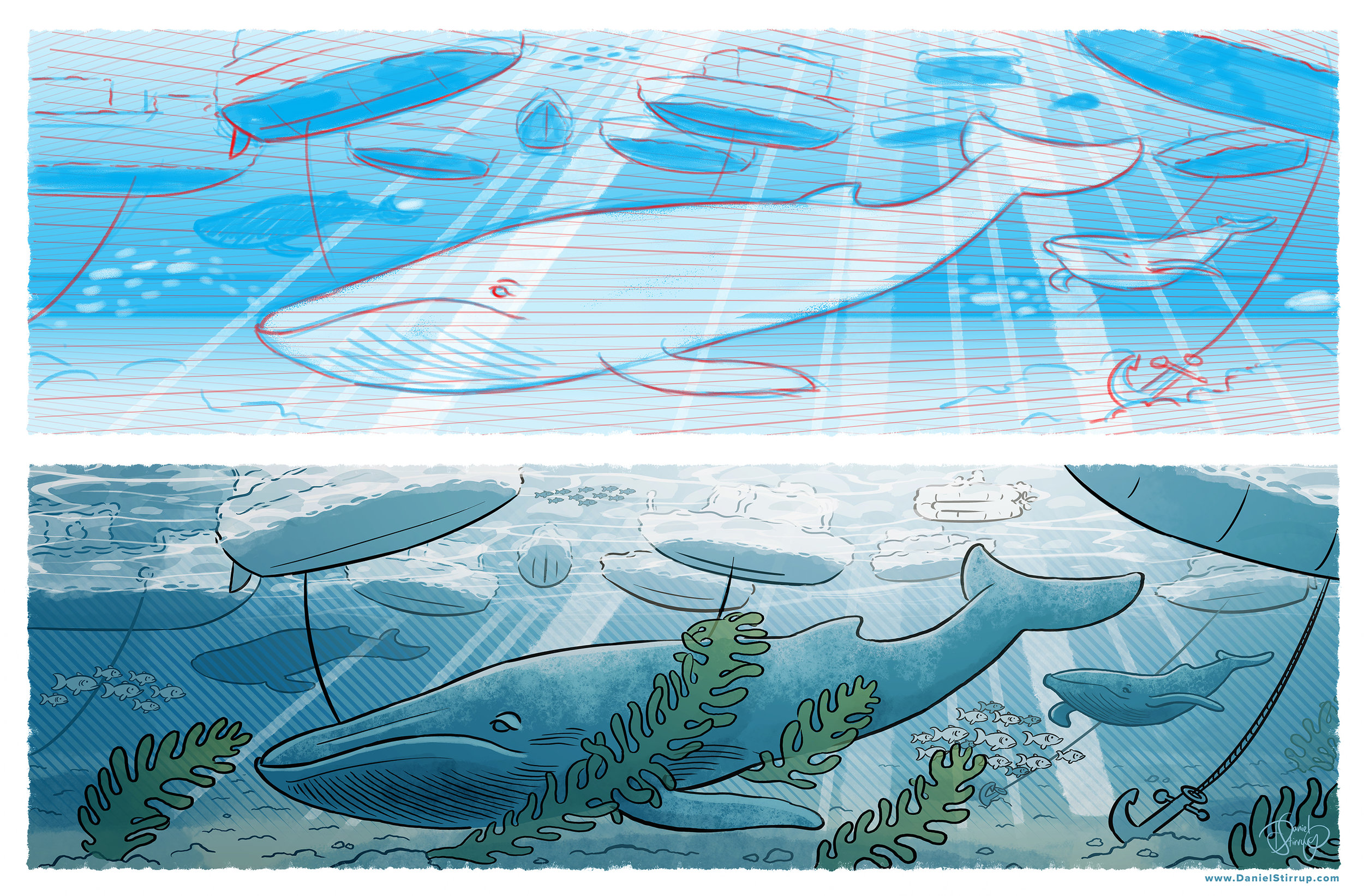
Over the next couple of years my confidence in digital drawing grew. I began to adopt a traditional blueline, redline and ink approach that was familiar from earlier experiments in traditional animation, but using digital brushes and layers. Using the Photoshop layers as a digital lightbox, I began to loosen up my style – the fear of a bad stroke giving way to quick, fluid lines. My left hand hovered permanently over the undo shortcut, and I would attempt a line again and again until I was happy.
As I felt more and more comfortable drawing in Photoshop, I began to view it as an enhanced extension of what I could achieve on paper, rather than a different medium entirely. With a combination of collaging and pencil roughs, I could mock up compositions with a speed and control that far exceeded my analogue work, but ultimately, I would still be shaping the final images with the arc of my arm and the flick of my wrist. I favoured the undo function over the eraser, stuck to a specific range of brush sizes, and worked in layers so that black ink could be lightened and coloured – separating a line drawing into different planes to give an illusion of depth, and ensure focus was in the necessary place.
A Wave of Whales: Final image and Blueline/Redline rough
I have recently honed the range of brushes I use to a regular five or six, which give me a good range of line work, washes and block colour. I now use perspective grids to define depth and space, I find they help shape the believability of a scene without stifling the composition. Defining a brush size range keeps things natural feeling, as it is very easy to zoom in and over work detail with tiny brushes, only to realise when you zoom out that the whole image has become lost in a mess of unreadable lines.
All of this grounds my technique in what would be possible with a few pens and sheets of paper, but allows me an effective range of tricks and techniques that let me take things that little bit further. Even with ambitious, complex illustrations I am able to maintain a creative flow, the biggest frustration being the new cat who is fond of chewing the Cintiq cables.
I have recently returned to analogue techniques, for sketch-booking and observational drawing. I have found that although the safety net has been removed, I am able to approach illustration with a more methodical, process based technique that has been informed by my digital work. The undo function maybe unavailable, but my brush and line work is more confident, as if the stabilisers have been removed and I realise I never needed them – they were a just a psychological crutch that made me feel safe.
For me, there is no need to choose between digital and analogue, the two can exist within my practice in a symbiotic relationship where one is constantly informing the other.


